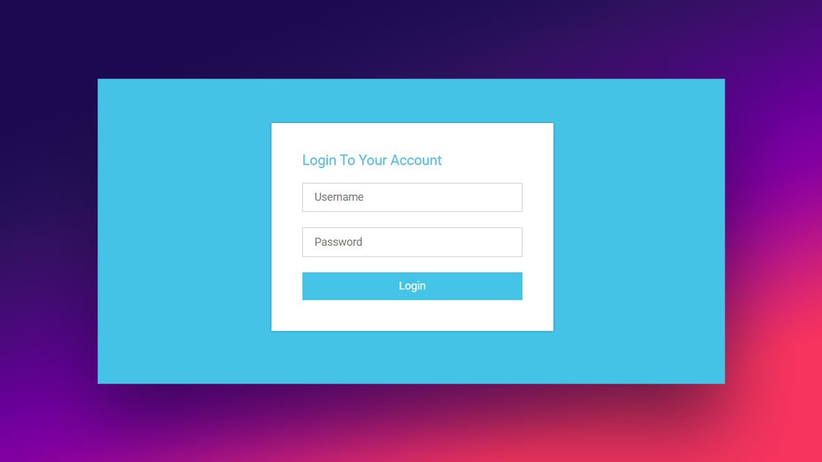
HTML forms are one of the most essential elements of the web. They handle contact submissions, account creation, search queries, checkout processes and more. While forms look simple on the surface, designing them effectively requires understanding user experience, accessibility and browser based validation capabilities. A well built form improves conversions, reduces user frustration and provides cleaner data for your backend. This comprehensive guide explains modern HTML form techniques, validation features and UX patterns that every developer should follow.
Table of Contents
The Importance of Well Designed HTML Forms
HTML Forms are the primary interaction point between a user and a website. Whether you are building a signup page or a feedback form, the structure and clarity of your form directly affect user completion rates. Poorly built forms cause abandoned submissions, incorrect data and accessibility challenges. Modern HTML provides powerful built in features that simplify development and improve usability when used correctly.
Use the Right Input Types
HTML5 introduced many new input types that help browsers understand what kind of data is expected. These include email, number, url, tel, date, time, password, search and range. Using appropriate input types brings several benefits. Mobile devices display optimized keyboards. Browsers perform automatic validation. Screen readers announce the purpose of the field correctly. For example, input type email automatically checks for proper email formatting. Using type number ensures users cannot enter invalid characters.
Developers can explore the full list of input types on the MDN documentation
Built In Validation
One of the most powerful features in modern HTML is built in client side validation. You can enforce rules without writing extra JavaScript. Required fields prevent empty submissions. Pattern attributes validate custom formats using regular expressions. Min and max restrict numerical values. Email and url automatically validate common formatting mistakes. Browsers provide real time feedback using native messages, which are accessible and consistent.
Example
<input type=”text” required pattern=”[A-Za-z ]+”>
Although JavaScript validation can extend functionality, the built in system should always be your foundation.
Simplify the Form Structure
Shorter forms convert better. Group related fields together and avoid asking for unnecessary information. If a field is optional, clearly mark it as optional to avoid confusion. Use proper labels instead of placeholder only forms. Labels improve accessibility and are essential for screen readers. Place each label before or above the field for improved readability. Avoid stacking too many fields without spacing, as it overwhelms users and hurts form flow.
Improve Usability with Clear Error Messages
Good error messages help users correct mistakes quickly. Instead of generic messages, provide descriptive feedback. For example, Instead of saying Invalid input, say Please enter a valid email address. Inline validation that happens immediately after the user leaves a field often improves completion rates. Always place the error message near the problematic field instead of at the bottom of the form.
Use Fieldsets and Legends for Grouped Forms
When a form contains multiple sections such as personal details, address or payment information, use fieldset and legend. This improves structure, accessibility and screen reader navigation. A clear legend tells the user what kind of information belongs to that group.
Example <fieldset> <legend>Personal Information</legend> <label>Name</label> <input type=”text”> </fieldset>
Make Forms Accessible for Everyone
Accessibility should never be optional. Use label tags connected through the for attribute or wrap the label around the input. Ensure proper focus states so keyboard users understand where they are. Use aria describedby to attach additional instructions to fields. Allow sufficient color contrast for input borders and errors. Make sure your form is fully navigable through the keyboard alone.
Avoid Placeholder Only HTML Forms
Placeholder only forms may look clean but they harm usability. Placeholders disappear when typing, which confuses users who forget the expected input. Labels should always be visible. If you prefer minimal design, use floating labels or keep labels above fields.
Enhance UX with Helpful Patterns
Use progress indicators for multi step forms. Provide autocomplete where appropriate. Use input mode for mobile friendly numeric or email keyboards. Show password toggles that allow users to view the password. Disable submit buttons after click to avoid duplicate submissions.
If your HTML form posts to an API, provide loading indicators and success states. For example, Contact form submitted successfully is more reassuring than redirecting users without context.
Spam Protection Without Heavy Tools
Simple forms can use honeypot fields or basic server side checks to block bots. Captcha should only be used when necessary because it impacts UX. Modern alternatives like Cloudflare Turnstile provide lightweight protection without harming usability.
Conclusion
Modern HTML forms combine structure, accessibility and a powerful built in validation system. By using the correct input types, improving readability, adding clear error feedback and ensuring accessibility, you can create forms that are easy to use and highly effective. Forms may seem simple, but when optimized properly, they significantly improve user satisfaction and conversion rates.


2 thoughts on “Modern HTML Forms – Best Practices and Validation – 2025”